Loading workspace
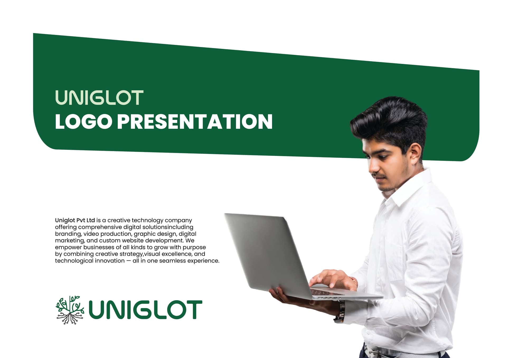
Project Overview
Uniglot is a language platform that needed a logo as versatile as the languages it serves — readable, distinctive, and free of cultural bias.
Client Background
Uniglot helps users learn and practice languages. Their platform is multilingual and multicultural by design. The identity needed to feel universal without being generic — smart, approachable, and built for digital-first use.
The Challenge
Creating a mark that doesn't favour any single cultural visual tradition, that scales cleanly from a mobile app icon to a website header, and that communicates both language and connection simultaneously.
Research & Discovery
Studied language-learning brands globally — Duolingo, Babbel, Pimsleur, and local alternatives. Most leaned heavily into speech bubble iconography. The opportunity was in a more abstract, geometric approach that suggested connection across languages.
Concept Development
Three directions: (1) Abstract letterform mark from 'U'. (2) Connected dots representing languages as nodes. (3) A clean wordmark with a subtle connection symbol. Direction 3 was refined — the wordmark approach gave maximum flexibility across platforms.
Iterations & Refinement
10 rounds of refinement across font selection, weight, spacing, and the connector symbol. The final version uses a custom-tracked wordmark with a small bridge element that represents linguistic connection.
The Final Solution
Clean wordmark + symbol mark. Works in colour and monochrome. Fully scalable from 16px favicon to billboard. Delivered with responsive logo variations for different use contexts.
Outcome
The logo was implemented across the platform's digital presence. The clean, neutral aesthetic was highlighted as a key strength — working equally well in English, Arabic, and Devanagari contexts.


