Loading workspace
Project Overview
DX Gaming Lounge needed a brand identity that communicated power, energy, and precision — a visual language that would work across signage, digital screens, merchandise, and social media without losing impact.
Client Background
DX Gaming Lounge is a premium gaming space catering to competitive and casual gamers. They had a strong concept and a great physical space, but no visual identity to match. They needed a brand that felt as high-performance as their setup.
The Challenge
The gaming industry is visually saturated — aggressive gradients, neon colours, and overwrought typography are the default. The challenge was to build an identity that felt premium and distinctive without falling into cliché, while still reading instantly as 'gaming'.
Research & Discovery
We analysed the visual territory of 15+ gaming brands globally — from esports teams to lounge chains. The pattern was clear: most used the same visual toolkit. The opportunity was in restraint. A bold monogram, strong geometry, and a limited colour palette could own more space than a complex busy logo.
Concept Development
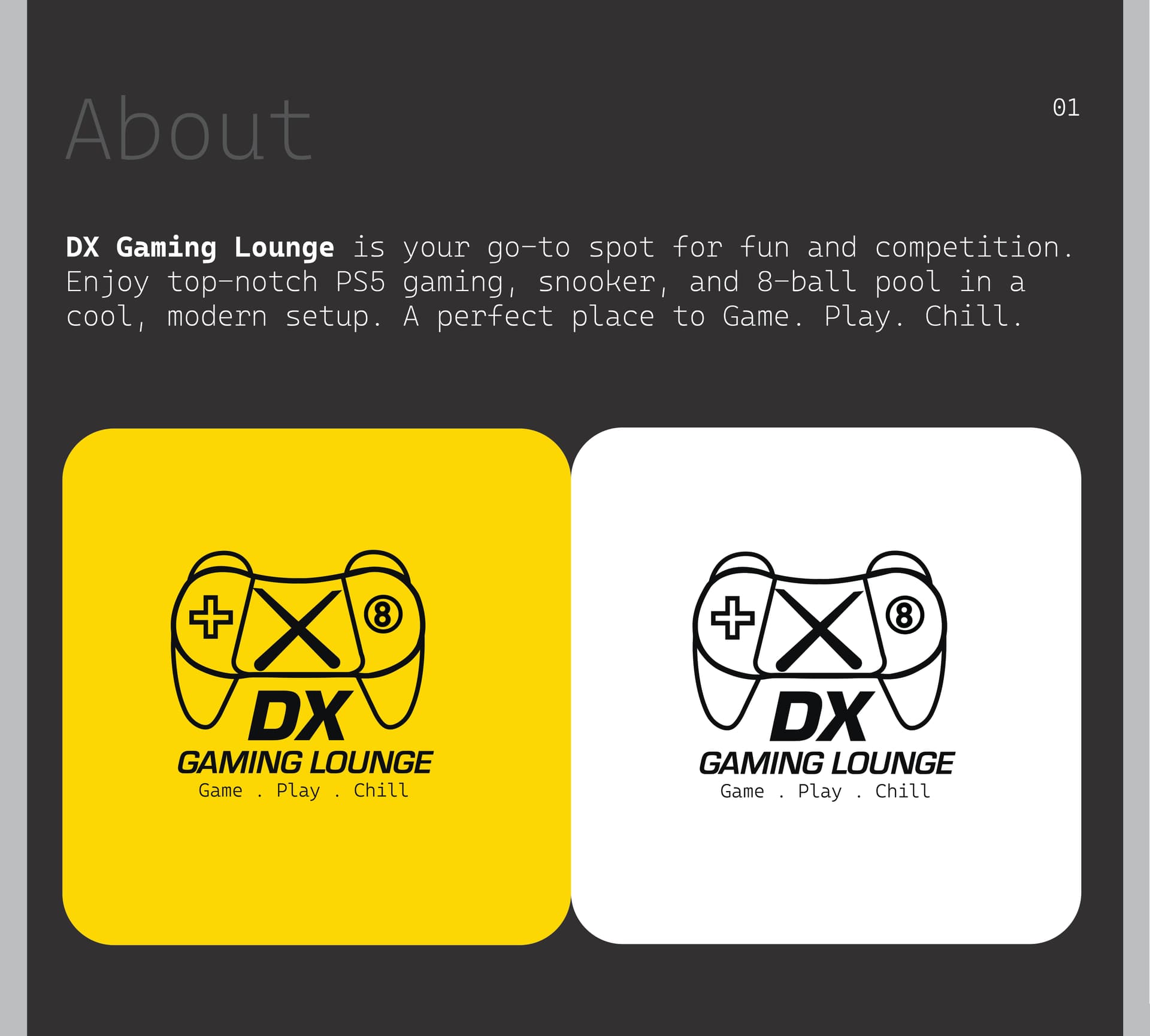
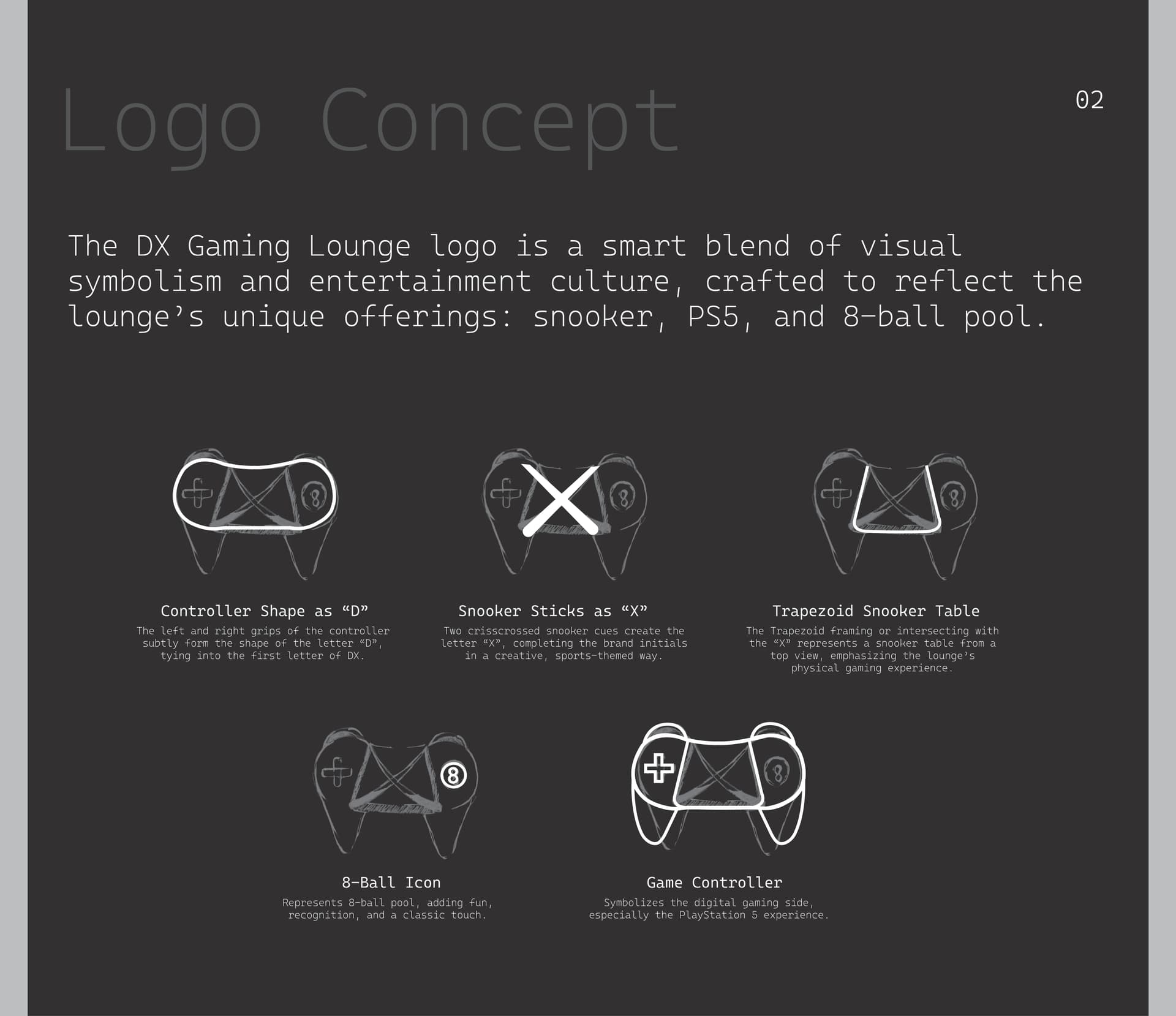
Three concept directions were developed: (1) A geometric monogram focusing on the 'DX' letterforms as interlocking shapes. (2) A controller silhouette integrated into a wordmark. (3) A stark sans-serif wordmark with an abstract power symbol. Direction 1 was selected for its versatility and uniqueness.
Iterations & Refinement
The monogram went through 12 iterations — exploring weight, spacing, corner radius, and negative space. The final version uses sharp angles that suggest precision and digital energy, balanced by a bold weight that holds up at small sizes.
The Final Solution
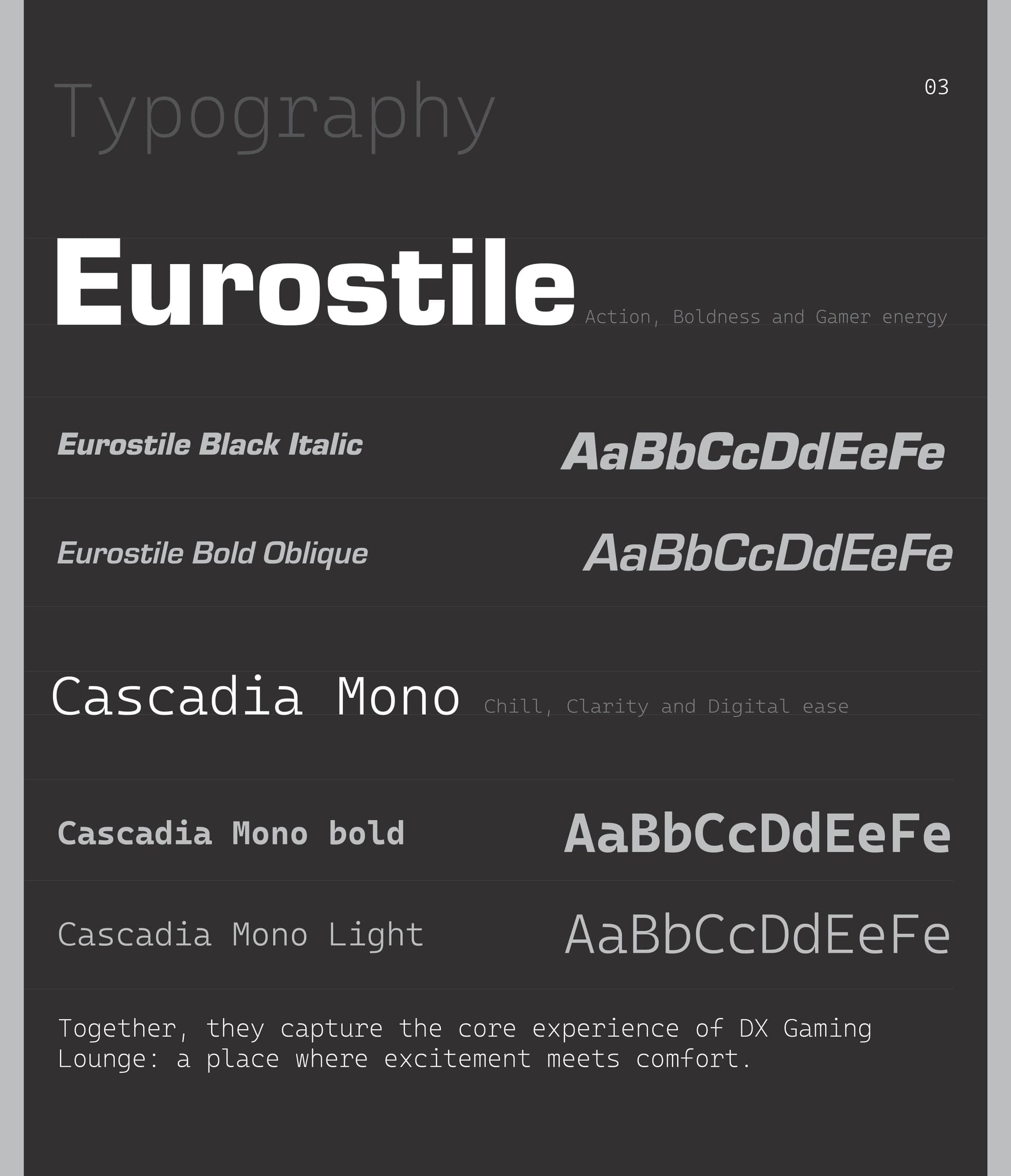
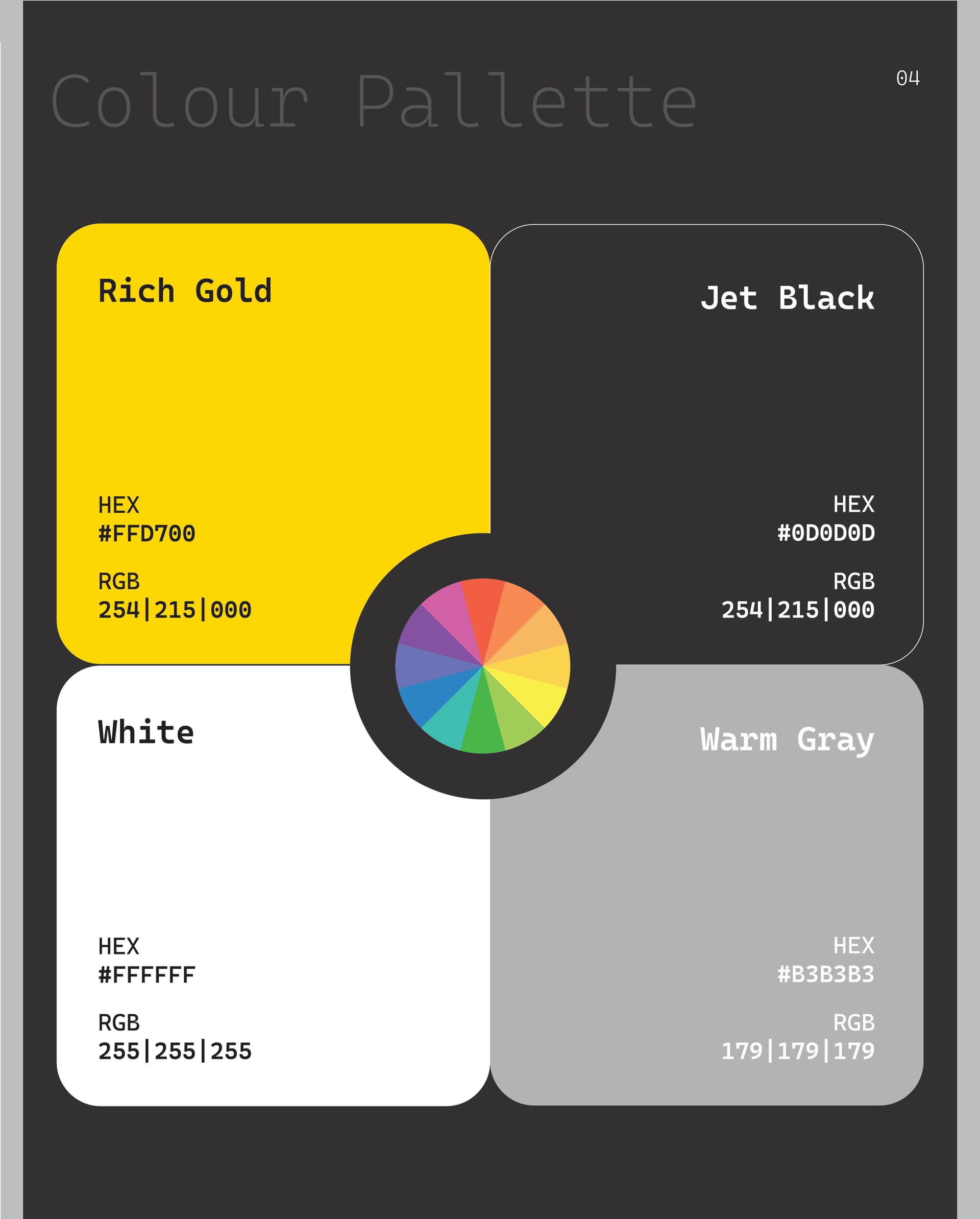
A complete identity system: primary logo, monogram mark, colour palette (deep black + electric accent), typography system, and usage guidelines. The mark works equally on a dark gaming screen and a printed membership card.
Outcome
The identity was deployed across the lounge's signage, social media, and merchandise. Client feedback highlighted the logo's instant recognition and how well it held up across different applications.