Loading workspace
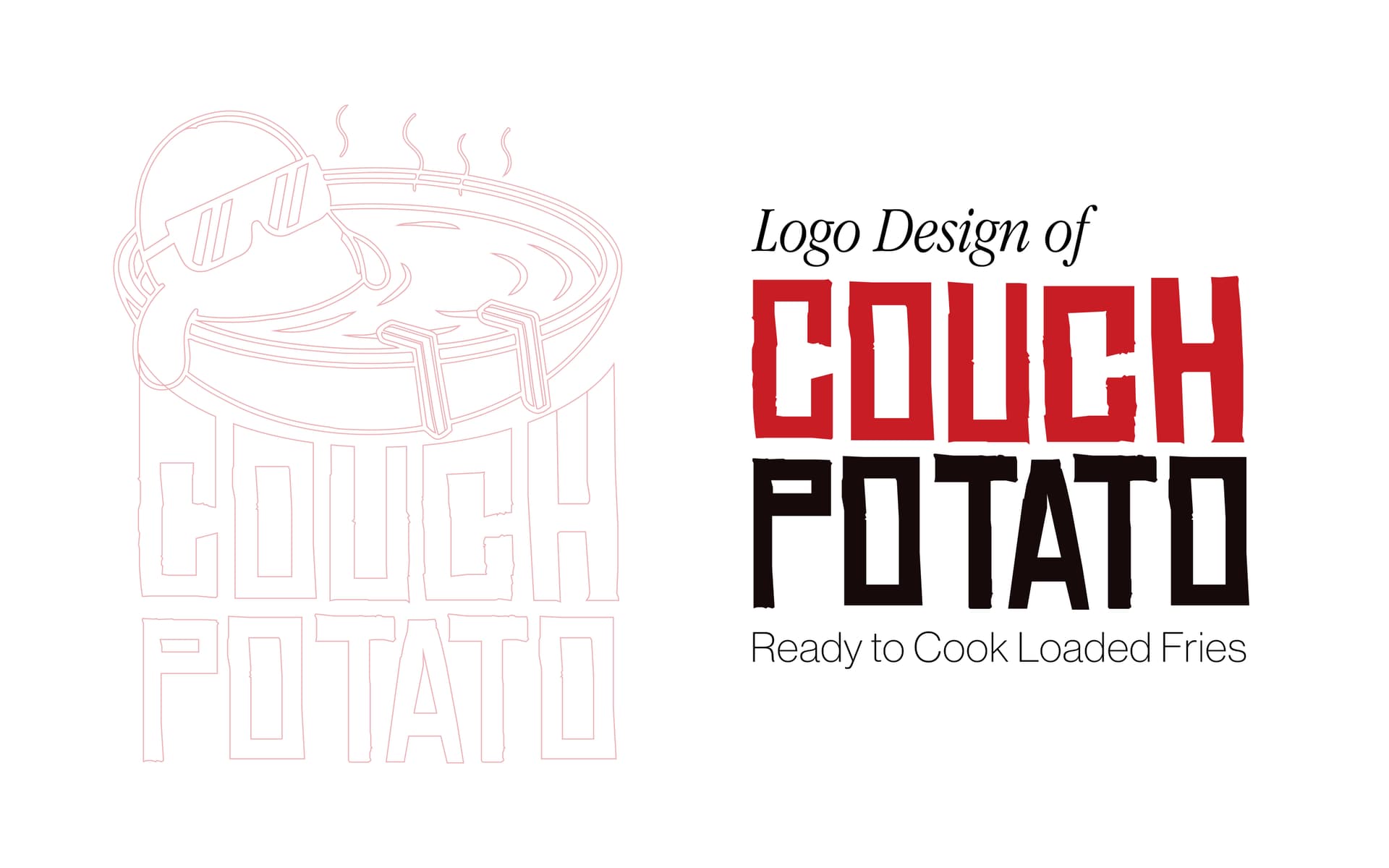
Project Overview
Couch Potato required a full brand identity system — a logo, colour language, and visual guidelines that balanced approachable comfort with enough visual confidence to stand out on social media.
Client Background
Couch Potato is a lifestyle brand built around the idea that downtime deserves to be done well. Their audience is young, social-media-native, and values authenticity over perfection. The brand needed to feel fun without being childish, relaxed without being invisible.
The Challenge
Translating 'couch' energy into a brand identity that could compete visually with more polished lifestyle brands — without losing the warmth and relatability that makes the concept work.
Research & Discovery
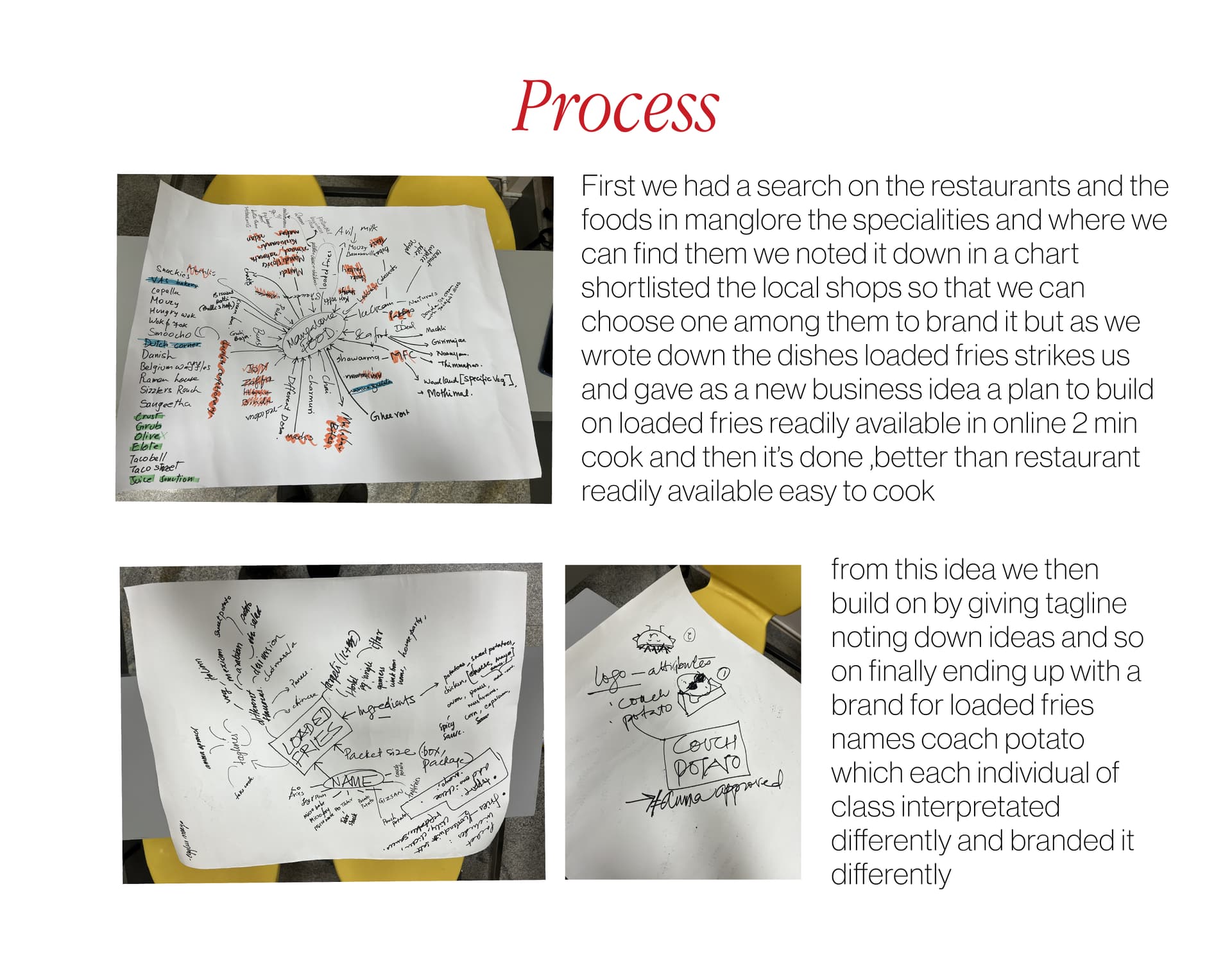
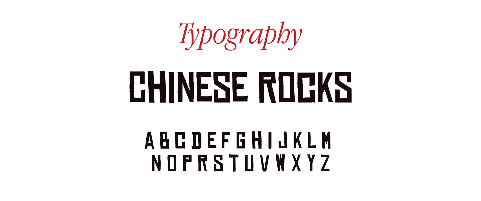
We studied 20 lifestyle brands in the comfort and casual wear space. The best ones used unexpected colour combinations and distinctive typography rather than complex illustrations. Simplicity was the differentiator.
Concept Development
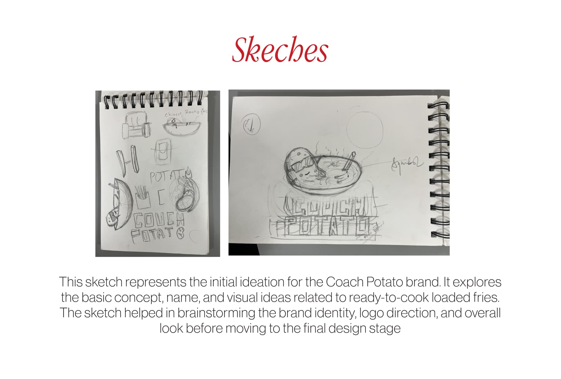
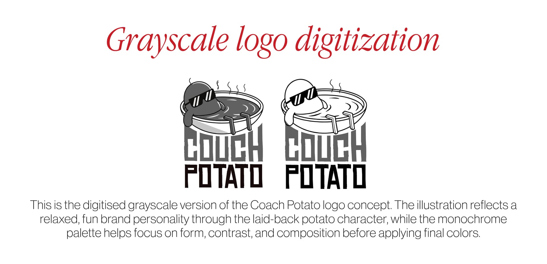
Two directions explored: a cartoon mascot-led identity vs a typography-forward wordmark. The wordmark approach won — clean, scalable, and more versatile across merchandise and digital use.
Iterations & Refinement
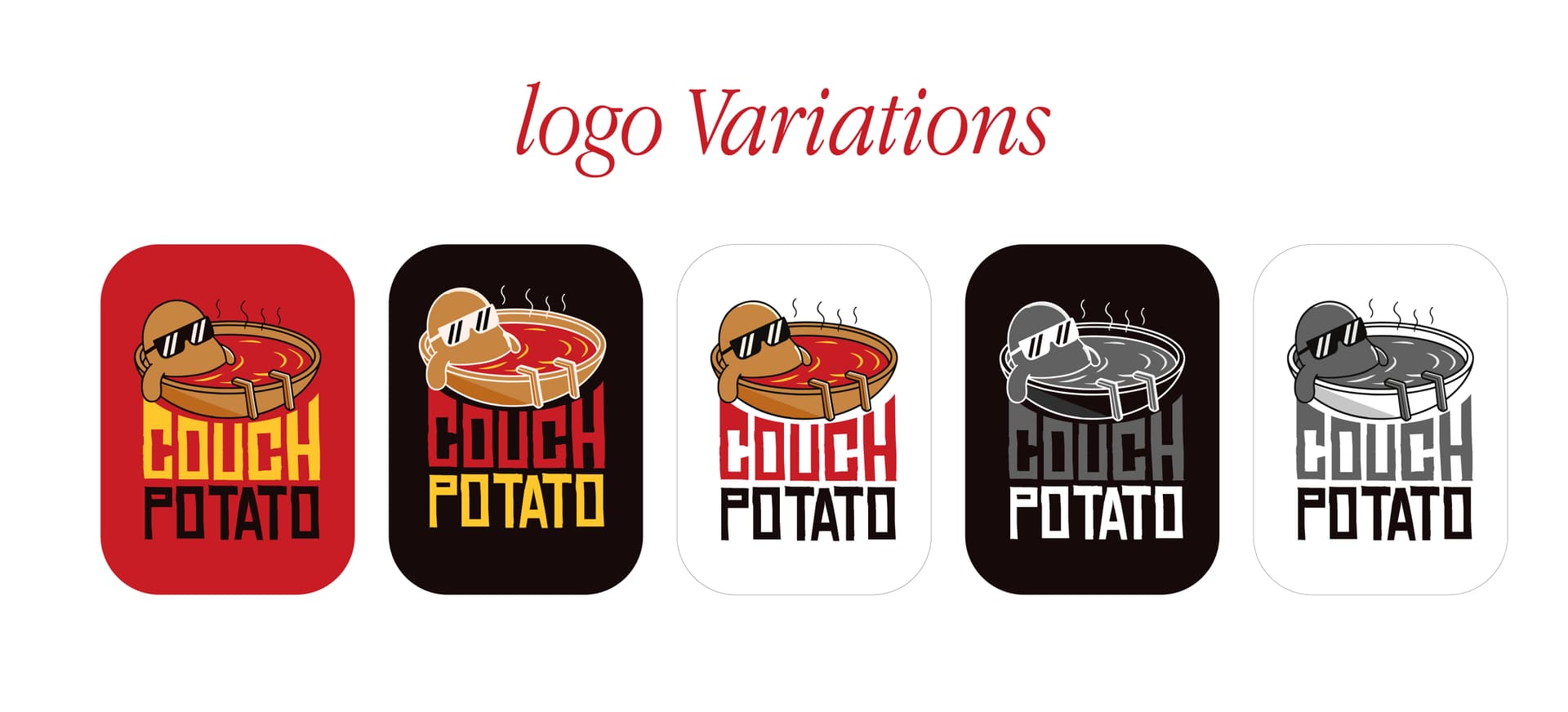
The wordmark went through 8 rounds, exploring font weight, tracking, and a signature element (a small sofa icon used as a period/full stop). The icon became the distinctive detail that makes the mark memorable.
The Final Solution
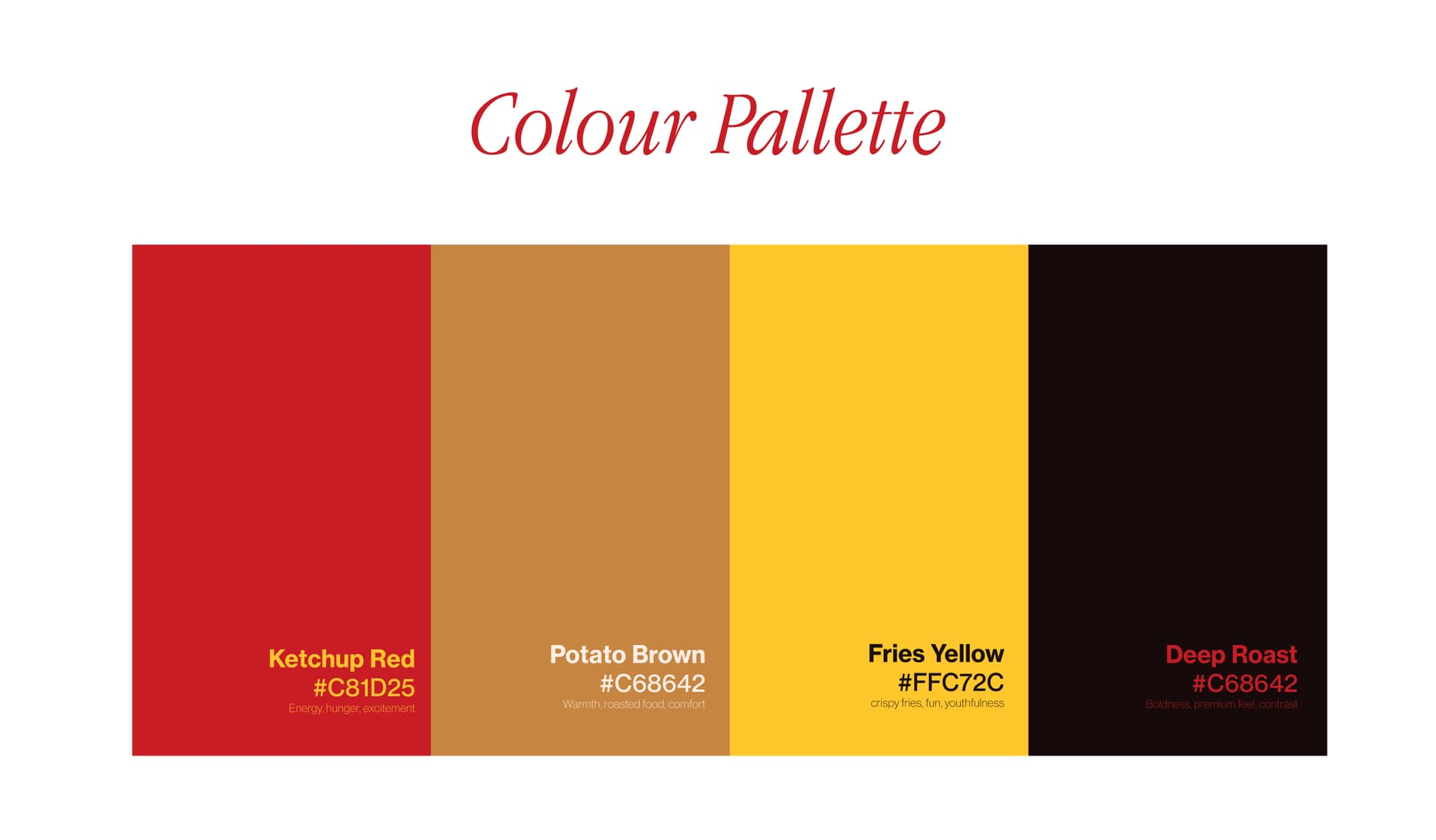
Bold wordmark with custom-tracked typography, a warm amber + cream + dark brown colour system, and a complete brand guide covering logo usage, colours, typography, and do's/don'ts.
Outcome
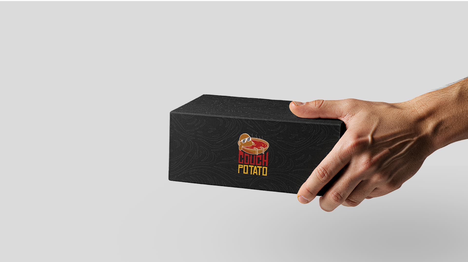
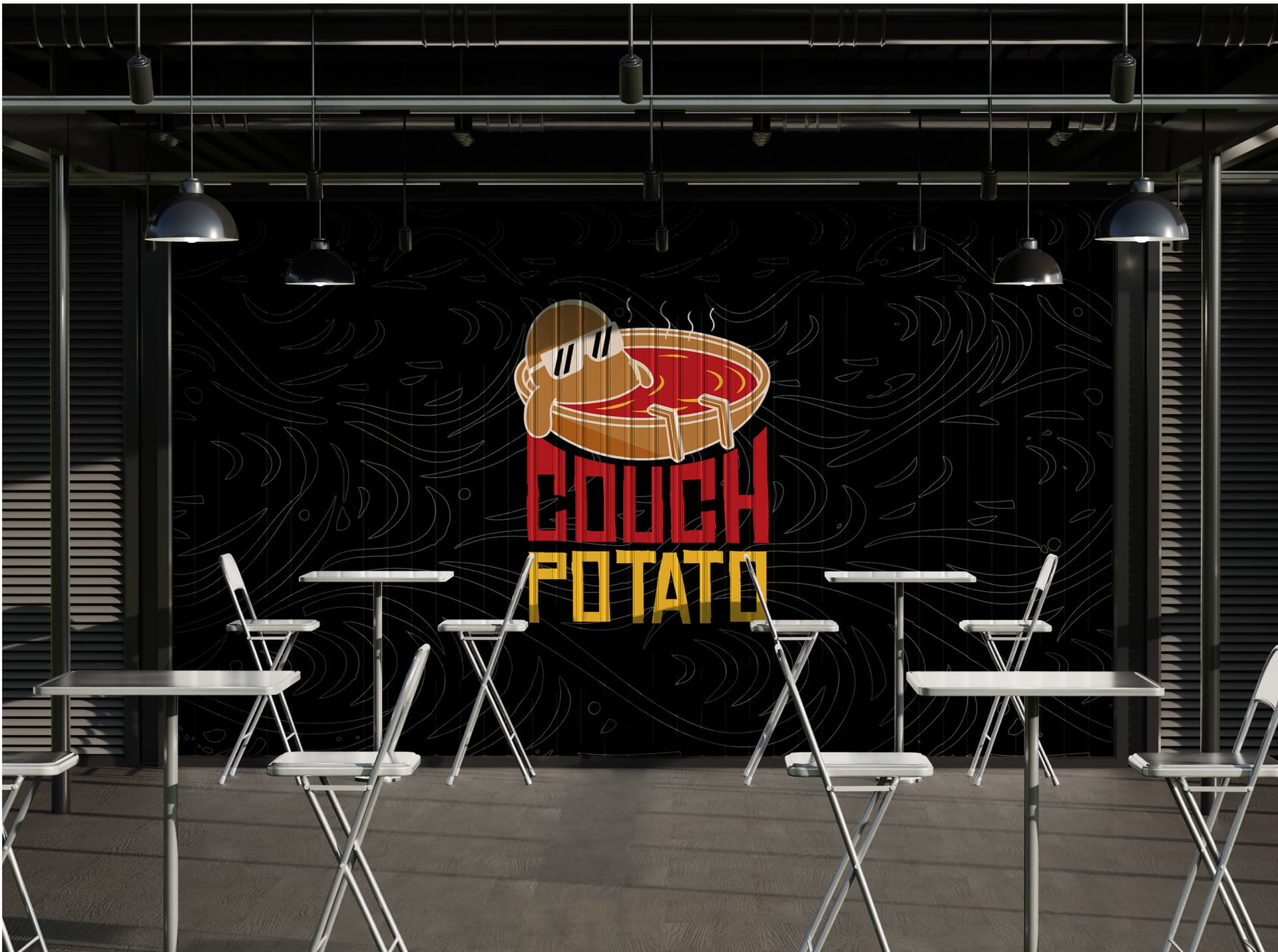
The completed brand system was delivered in full. The client used it across their social media profiles and packaging, noting that the visual identity immediately elevated how the brand was perceived online.